
The 3 Values of Design
A guide for a better understanding of design from a value and business perspective.
Applying mental energy on designing produces multidimensional value. The better we are capable of segmenting and understanding that value, the better we become at designing, as designers.
Design outcomes — they are our world
Any human is capable of creating something, let’s call those creations a design outcome.
Those outcomes can be anything starting from a simple thought to change something. Anyone produces them.
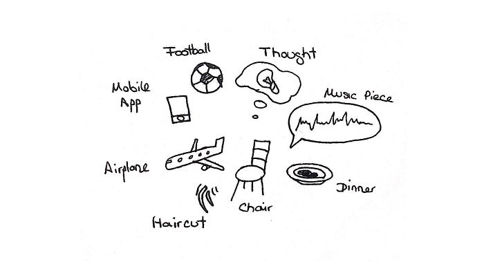
A design outcome influences its environment

The result and impact of a design outcome will always have a complex impact to its environment. The problem is any design is impactful in so many ways — you cannot measure just a couple of indicators. The impact of a design is n-dimensional where n is always at least 1 larger than you’re able to imagine. “I know that I know nothing” only seems about right. Only the aspects you consider can be manipulated.
“The Agricultural Revolution was history’s biggest fraud”, Yuval Noah Harari, Sapiens, 2011
In his book Sapiens, the author Harari refers to a mistake humans have made, because they only saw immediate benefits without fully understanding the complex consequences of a systematic redesign going from nomadism to agriculture. History will give you millions of examples with the same result. If the human race was to exterminate each other one day you would be able to trace back all mistakes to the decision making process on attractive ideas that aren’t fully understood. A mistake of not understanding the impact of a design outcome.
Producing a design outcome is embraced by a before and after state
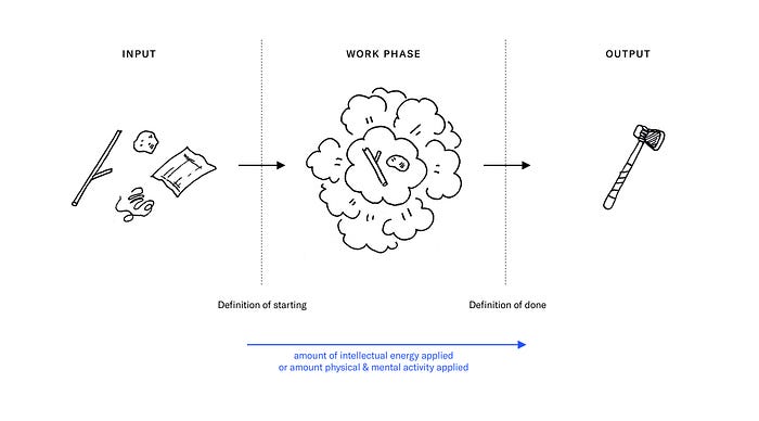
A designed outcome consists of a blurry entanglement of prioritized ideas to achieve considered goals. Creating a designed outcome is a task of manipulation where there is a before and after.
Why is understanding the implications of design not obvious?
The comparison to understanding foreign languages is quite fitting to understanding the implications of design.
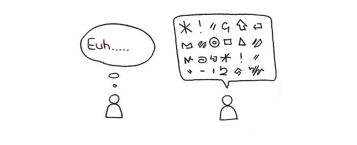
If you listen to a foreign language being spoken for 1 year without ever being told the meaning of a given word or ever being able to put the heard into context — chances are zero you won’t be able to catch up and learn the language.
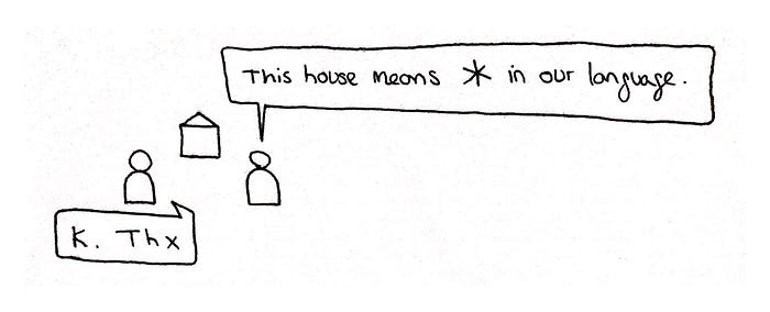
If you were to learn a foreign language, the fundamental principle to learning is by being taught the direct meaning of a thing in both languages allowing you to bridge context.
Journey to artificial intelligence
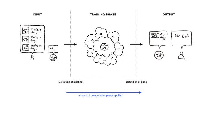
In machine learning (a field of artificial intelligence) scientists use supervised learning: teaching inputs with the translated answers is to train neural networks to understand data. Compared to the method of just giving data to the same neural networks and waiting for it to understand it itself (unsupervised learning) the labeled method is incredibly much faster.
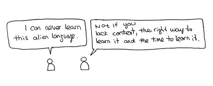
Sometimes the lack of data even determines wether something can be learned after all. Could this mean for us that without the right learning settings we might not be able to understand certain things within our short lifetime? I believe so.
Setting for “intelligent” outcomes

Now when comparing the visualization of how I demonstrate the act of doing design and the act of neural networks learning something, they both have the before and after state on a linear time scale. This could mean an insufficently long learning phase, not enough research informations or too much data without context might lead to a lower form of “intelligent” design outcome.
Which also means the a longer learning phase, more research informations and more contextual data (substance) lead to a higher form of “intelligent” design outcome.
The rules for unsupervised learning apply
If we know less meanings of something in our environment it gets harder to understand the whole.
The definition of starting
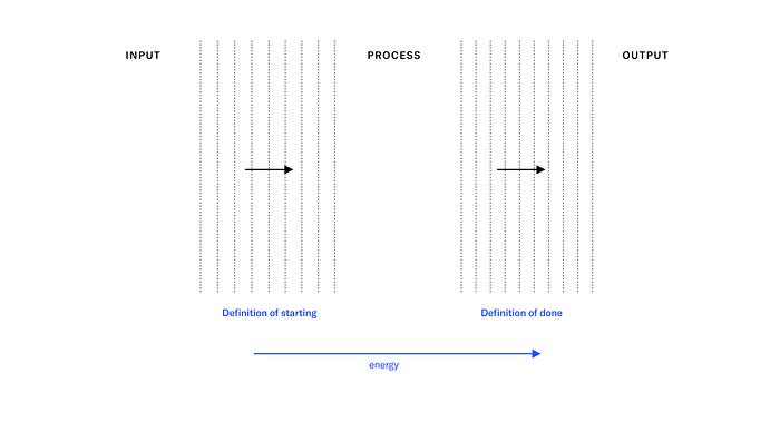
Imagine you’ve officially started writing on a document yesterday.
Did you really start from 0 yesterday?
Most individuals have a broad palette of experiences and skills allocated in their mind and body that influence what they do. You haven’t learned your language by yesterday, that’s for sure. Some of your ideas and thoughts should be older than 24 hours aswell. So while we like to say: “I started 2 weeks ago” you’ve actually passively prepared with the first sensoric input stored in your memory cells, meaning since you’re alive. Your DNA is a format of information storage meaning the document you’ve been writing on since yesterday could have been prepared since very existence… kind of.
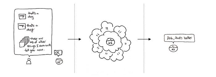
The preparation is also used in training AI for neural networks are designed to understand the world of images, but should understand animals especially well, always have a pre-trained memory of other images as a basis and/or a use a neural architecture with pre-trained weights that suit especially well for image recognition.
With infinite resources: more = better

Assuming we had a slider to add time, data and increase the percentage of labeled data inside the data this would all positively impact the outcome. No exceptions.
In the world this happens with the big problems: thousands of people working full-time on the same thing instead of just a single individual.
The biggest existing economical challenges (market demands) can often be found tackled by the largest corporations, because it’s worth throwing more people at and there is a return of time, energy and salary investment.
Let’s look at what I call the 3 values of design with which every designed outcome can be torn apart to understand it so you can understand the same topic in a lower amount of time.
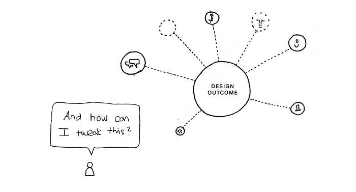
Doing the “design” is the art of prioritizing different goals to manipulate input informations towards a new output information.
Prioritization is needed in every scenario of limitation.

Design Value 1 — Usability
Usability describes how good something is at what it’s intended to do.
As a designer you design usable products,
by estimating the users capabilities and understanding the intended function to produce a tool that serves its purpose.
Usability describes the attribute of any object that is perceived to have a purpose.
Focused human interference in designing the relationship between the user, the medium and the purpose can impact the usability of an object, product or service.
I like to use the word “tool” which requires a situation of use to be a tool.
What can you achieve with usability?
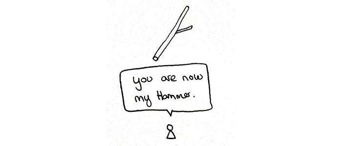
You can go out into the woods, break a branch and form a stick –
look at it and say: “I am going to perceive your purpose to hammer other objects into the ground” –

then proceed to add a piece of cloth where your hand is grabbing the stick to enhance the object to your human capabilities of grabbing the object –

then proceed to tie a rock to the end of the stick to increase the force of impact with which the stick will hit the future object that should be hammered into the ground.

You’ve just worked in a user centric way, by optimizing the grabbing point for your hand and in a functional way by increasing the efficiency output of performing the act of hammering.
Usability is always bound to how we see objects and their functional purpose.
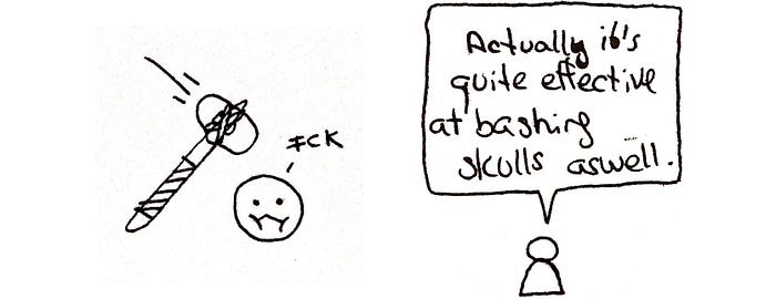
A stick can also be seen as a weapon to beat someone while still keeping its attributes as a hard-to-use hammer.
It is part of good usability to give tools the form that intuitively indicates their function. Symbolism usually catches on this moment in design and injects sales accelerating strategies.
Why is usability important?

Depending on how easy-to-use the tool is designed, it will be engaged with by people. Every tool has to be designed according to the capabilities of its user.
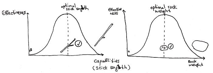
Depending on how functional the tool is designed, it will impact the effect it has when it’s used.

The business model for Usability
As a designer
you get paid for knowing how to adjust a tool to its users capabilities and increasing the effect it has when it’s used by investing your personal time producing a designed outcome (see intro) that is better than the status quo.

The value of the tool increases, allowing your client/company to lose less users using the product and referring the product for its quality, increasing the customer lifetime value and therefore the economic value produced, allowing your client/company to capture more of this produced value allowing you to capture some of this value for yourself.
Increasing usability in the world is often seen as the “true” way to improve the quality of the world.
If only it weren’t for the following 2 other design values.
Maybe you’ve once heard something like “The best product never changes the world, the best marketed product does”.

Design Value 2— Symbolism
As a designer you enforce symbolism,
by taking a thing and wrapping it in a new meaning and communicating these meanings. Symbolism happens passively with or without human interference. In our world we constantly alter the meaning of the things in our environment. Focused human interference can impact the symbolic meaning of an object.

What can you achieve with the skill of manipulating symbolism?
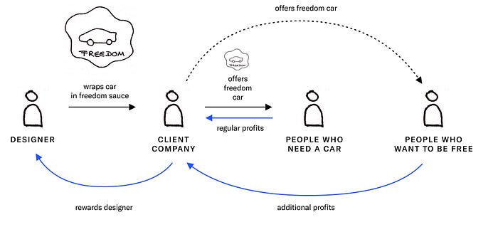
You can turn an object like a “Car” –
that is designed to supply the need of human individuals to go from A to B –
and repeatedly manipulate people with your communication strategy –to perceive this object “Car” not as a vehicle to go from A to B –
but as the emotion of freedom.
Why would you want people see “freedom” instead of “solution from A to B” when looking at a car?
Because “freedom” is a very powerful emotion.
This emotion “freedom” makes people think differently when thinking about purchasing strategies. The behavior is less rational in terms of budgeting this purchase.
And the question “Do you want to be free?”
Is a much easier “yes” answer than
“Do you need an A to B tool alternative to borrowing your friends car, taking the public transport, joining a car sharing club or not going from A to B?”
This is one example of how a car can be branded to an emotion.
Any object can be branded to any emotion.
Symbol comparison
A wine bottle is a volume made out of glass to contain fermented grape juice, sealed with a cork to prevent the liquid from reacting with oxygen in the air and losing its taste. It’s also an ancient technique to store liquids in glass and cork.

A wine tetra pak is a volume made out of a paper-aluminium-polyethylene mix to contain fermented grape juice, sealed with a plastic lid to prevent the liquid from reacting with oxygen in the air and losing its taste. It’s also a progressive and new technique to store liquids in tetra paks.
Let’s compare what we feel when we see these two objects.
I perceive the wine bottle as an object symbolizing a quality, classy, cultural way of consuming a delicacy.
I perceive the wine tetra pak not as quality wine and its consumption not a classy and cultural act.
The business model of symbolism
As a designer
you get paid for knowing how to craft a communication strategy that manipulates people into buying more, cancelling less, or similar. Because your client makes more revenue, he can pay you. You’re manipulating the way your clients/companies customers think, hijacking powerful needs and binding them to your clients/companies product.
You produce economic value for your client/company and capture some of this value for yourself.
There are 3 methods to monetize symbolism as a designer, two of them are competitive scenarios.
The first one only really applies to satisfying needs in markets where customer groups aren’t fought over.
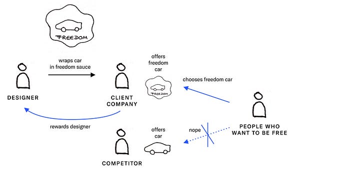
The second one highlights competition where symbolism is utilized to gain a competitive advantage over customers.
The last one shows a competitive scenario where customers are fought over a car customer who has to decide based on symbolized needs.
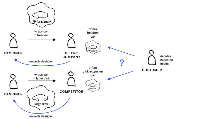
If you understand that symbolism is heavily used in a competitive environment you might also find it interesting that brands that don’t really have a unique product/service utilize symbolism the most. Look at mobile network providers, energy companies or crypto startups.

Design Value 3 — Entertainment
Entertainment describes the situation where physical sensoric stimulation triggers chemical compound releases that affect emotional state of the conscience of creatures.
We feel alive.
We feel: “This is worthwhile.”
We usually don’t actively think about wether we’re entertained or not.
We just leave the website, close the app, look away from the poster, stop to read, drift towards other thoughts.
We want to be entertained — to avoid confronting ourselves with what’s in us and maybe… find true happiness and what not. Better get entertained.
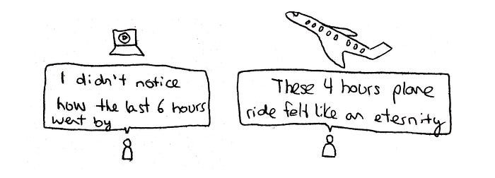
Perceived time is the currency of entertainment.
With our body we can’t sense time by analyzing half-time periods of identified isotope molecules in our environment.
Entertainment is the art of keeping us in the now and holding a dialogue. What value to a message if nobody listens more than 1 sentence?

As a designer you entertain,
by manipulating a medium containing informations to appear attractive to their audience.
Entertainment happens passively with or without human interference. Focused human interference through manipulation can impact the entertainment value of an information.
What can you achieve with it?
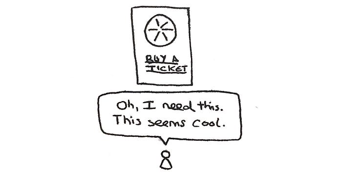
Imagine this story is a movie that is happening and everyone is invited to buy a ticket.
You can turn the information of the upcoming movie into a visual medium of such beauty and attractiveness –
and put this medium out there where people can see it –
to have them perceive the event as an event where they should go to.
You’ve created an experience for these people during the moment of consumption, a medium that talks to them and influences their opinion about the original information of being an event of 3 hours length to buy a ticket and watch a movie.
The entertaining experience triggers positive reactions of the consumer and raises a moment of emotional decision making and like in the first business model of symbolism, emotions that are in the core of decision making.
Perhaps you’ve never looked at it this way:
Everything is entertainment.

A typeface of a book has an entertainment value. If it’s ugly and bad and you’ve a hard time to read, the information and story to be told gets harder to consume, making it more painful for a potentially great story to be consumed.
An artwork has entertainment value. If it speaks to you and you can engage with it, if it has something to it you like or tells a story you’ve never heard before, you will spend more time looking at it and he emotionalized about it.
Entertainment of a landing page

Imagine you are visiting a website which happens to be a single-page landingpage.
The content itself can be uninteresting for you to read, because you don’t want to buy what the website is selling, but because it’s been made very nicely and there are these beautiful icons and illustrations and the layout is appealing you get a positive feeling about spending your time here.
Entertainment of nature
A look out of the window into the skyline of a city is just a 3-dimensional visual perspective of civilization and nature in a unique place and time. No human has designed it intentionally for you to have the whole thing look good in this exact moment and from this point.
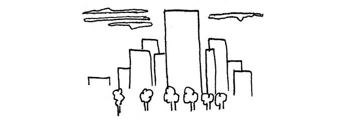
You might feel a certain emotion looking out of the window on the calm city in the late afternoon and be entertained by it.
The business model of entertainment

As a designer
you get paid to reduce the amount of people not reading and memorizing the message of your client/company.
You increase the effectiveness of entertainment in a message your client/company is communicating to her consumers.
More consumers reading the message until the end have a multiplication effect of the goal the client/company wants to achieve making the act of communication more valuable.
You reduce perceived time in an experience and increase chances of users reaching the end of the experience triggering a key action.
Because your client/company makes more revenue, loses less revenue or increases in any important number in the business ecosystem, he can pay you.
You produce economic (or social, or cultural) value for your client/company and capture some of this value for yourself.
Wrap Up

Understanding the value of design will undoubtably help all those who seek to fight for what they perceive as good.
For designers
Be clear on the goal, then derive which value of design supports its achievement. It will help you keep a clear mind to put effort on entertainment, symbolism, or usability – or a combination.
Cut away the slack and be honest with yourself why you are doing what you are doing with the altered (and hopefully improved) consciousness of the setting.
For design value beneficiaries
Think about which of the 3 design values you need. Think about how the skills of your professional counterpart will help you leverage their competence as a designer to provide you with these values and communicate clearly to what you need. When being confronted with concepts, proposals and results, use the 3 design values to explain why you feel certain aspects to a thought or work aren’t supporting the goal to utilize the 3 design values to achieve effective business outcomes.
Put your efforts on clear goals through the lenses of the 3 design values and measure the outcome.
